5 Great Fonts for Book Covers
by JOEL FRIEDLANDER on AUGUST 30, 2011 · 64 COMMENTS
 One of the most consistent and easily corrected mistakes I see with book covers that are designed by authors is weak or inappropriate typography. Given that a book cover usually has very few words on it, and those words (title, subtitle, author’s name) have a huge influence on buying decisions, this can be a major problem.
For instance, if you’re writing about a topic considered masculine and aimed at a male audience, does it help you to have an overly-embellished or feminine typeface that’s barely readable on your book cover? No, I don’t think so either. Or for a historical romance, you wouldn’t want a modern clean sans serif typeface like Helvetica for your cover. It would simply look dangerously out of place.
How Inappropriate Typefaces Happen
The reasons some authors end up with this kind of typography on their book covers include:
- A lack of design training
- Only judging what is seen on the screen and being unable to visualize the effect on a printed cover
- Using the typefaces that came with the computer
This last reason is probably the most common. After all, when you look down that long list of fonts, it seems that there should be something there that’s usable, right? But that’s not always the case.
Display fonts are different from text fonts. Their weights, spacing, set widths and many other tiny details differ. It’s difficult to impossible to make a text typeface look really good on a book cover. I’m not saying you’ll never see this done well, but it’s much more likely that the cover you’re looking at with that gorgeous Garamond on it was done by a professional designer with years of experience and a lot of graphic tricks up her sleeve.
No, it’s far better for amateurs to use display typefaces when it comes to their book covers. To help out, here are 5 typefaces, some of them free, that you can experiment with on your book covers.
5 Great Fonts for Your Book Cover
To get you started, I’ve collected 5 great fonts for book cover design. Even better, three of them are free, and you can download them at fontsquirrel.com, so start experimenting with these for your book cover.
1. Chunk Five (free from fontsquirrel.com): This meaty and emphatic slab serif font is ideal for book titles in numerous genres. Try this font for action-oriented or political stories. Here’s a cover I did for an around-the-world sailing story:
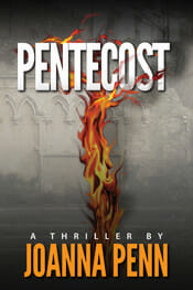
2. League Gothic (free from fontsquirrel.com): This sans serif font is very vertical, which is ideal for book titles. League Gothic would be a great choice for thrillers or business books, and it can be useful if you have a very long title, too. Here’s a sample on Joanna Penn’s terrific thriller.
3. Trajan (available from Adobe): You might recognize Trajan, and that’s because it’s been used for more movie posters than any other font. It works quite well on books, too. This classic font is appropriate for histories, novels, and historical fiction, among others. Check out the French film poster using Trajan.
4. Franchise (free from fontsquirrel.com): Another tall and meaty sans serif, just ideal for the right book cover treatment. Franchise would be a great pick for a historical epic, for mysteries, or for thrillers. Here’s a sample of a novel in a gritty urban setting.
5. Baskerville (many versions available): Sometimes you need to have a straight roman typeface for your title, and in that case I like to use one of the variations of Baskerville, a highly readable typeface. You might find Baskerville perfect for a memoir, a business book, or a historical romance. Here’s a sample, and a cover from Vintage Books that shows how effective it can be.
The best way to see the effect these fonts will have on your book is by trying them out. Since most of them are free, there’s no reason not to. Just looking at these fonts and imagining them on a book cover helps give you a sense of how the fonts you choose influence the look and tone of your book.
I was stuck as to which typeface I could use on my book jacket so I chose to ask Google’s advice which lead me to this website. Giving me five suggested typefaces, this article suggests to just give a typeface a try and see what feeling it evokes. Personally I feel that If I had a great knowledge of typefaces I would have more of a gut feeling as to what typeface I would use.. I do have a preference to a sans serif typeface as I feel it has more impact.
For the book cover that is designed to be part of a series I would consider a serif typeface as I feel they have more historic emotions to them.
http://www.thebookdesigner.com/2011/08/5-great-fonts-for-book-covers/
Time viewed 23:49


