An information Graphic which caught my eye.

This is an information graphic that that caught my eye. I was attracted to how the circle diagrams were simplefied out for the reader along side the attractive complicated one. Sadly I was not able to see the image at closwer inspection and not able to understand the information with out closwer inspection.

http://13pt.com/projects/nyt071216/

Good information graphics- what makes one?

The term “infographic” is used to refer to an “informational graphical image.” In an infographic design, communications challenges are married to illustrated explanations in order to convey a specific point of view. These designs are educational or representative and the term infographic encompasses a full range of the visual graphics that surround you every day. Road signs and maps are two common examples of infographics, as are charts depicting the weather, statistical data, and technical drawings. These graphics are best utilized to convey information in a succinct format and good examples are constantly being created. Magazines and news services use infographics on a daily basis to convey points in their articles. Companies create infographics to market their products and services. The routine usage of these illustrations has been around for a long time but there are changes in their usage thanks to the internet.


With the advent of widespread social media, infographics have become an online medium to express everything from new scientific discoveries to irreverent humor. Not all the ways that infographics are used online are new or revolutionary, but the sheer frequency of their appearance is only increasing. In addition to daily charts, graphics, and images, many artists and designers create infographics for their own personal projects and expressions of opinion. Everything from procrastination to popular culture has been thoroughly illustrated and whatever your pleasure, you are sure to find something addressing complexities you never knew existed.


What Elements Comprise a Good Infographic?

  • Facts  An infographic is only as good as the reason for its creation. Solid information is the foundation of a chart or graphic. The data that you work with must be credible. It must be relevant to the audience you are targeting regardless of your approach to the piece.
  • Point of View  The spark that makes for a good infographic is the unique angle of approach when given raw data. Incorporated into the visuals is the designer’s point of view – without some sort of argument or point of view, what’s the point of the infographic? Why is your information important enough for the viewers to look at it?
  • Design  An all-encompassing term, the design of your infographic determines whether or not it gets read, regardless of the value of its content. Considerations into typography, colors, and general presentation are essential to tell the viewer at a glance what you are trying to convey. Clever and unusual visualizations help distinguish your data by presenting it in a surprising or unique manner that still makes sense. Once the general design is sketched out, reference points within the illustration help the viewer understand the information using non-textual icons such as arrows, logos, and other graphical symbols.
  • Excitement  The best examples generate a bit of excitement! They make you remember their facts and cause you to share them with everyone you talk to after seeing them. When a great infograph goes viral, there are so many platforms to share and view that it becomes hard to keep track of. From tumblr to Facebook and Twitter, an interesting infographic gets shared frequently.


Good Information Design

Infographics combine facts into a design to create a certain point of view. Something is being conveyed to the reader. The best infographics utilize interesting facts and stunning but logical visuals to catch a viewer’s attention. Ease of comprehension and relevance are mixed with a beautiful design and specific facts to create a successful infographic. Check out some examples below for a variety of different approaches. Although some are laid out similarly, the information they present is varied, showing how the same format can be used to present different types of data.


——

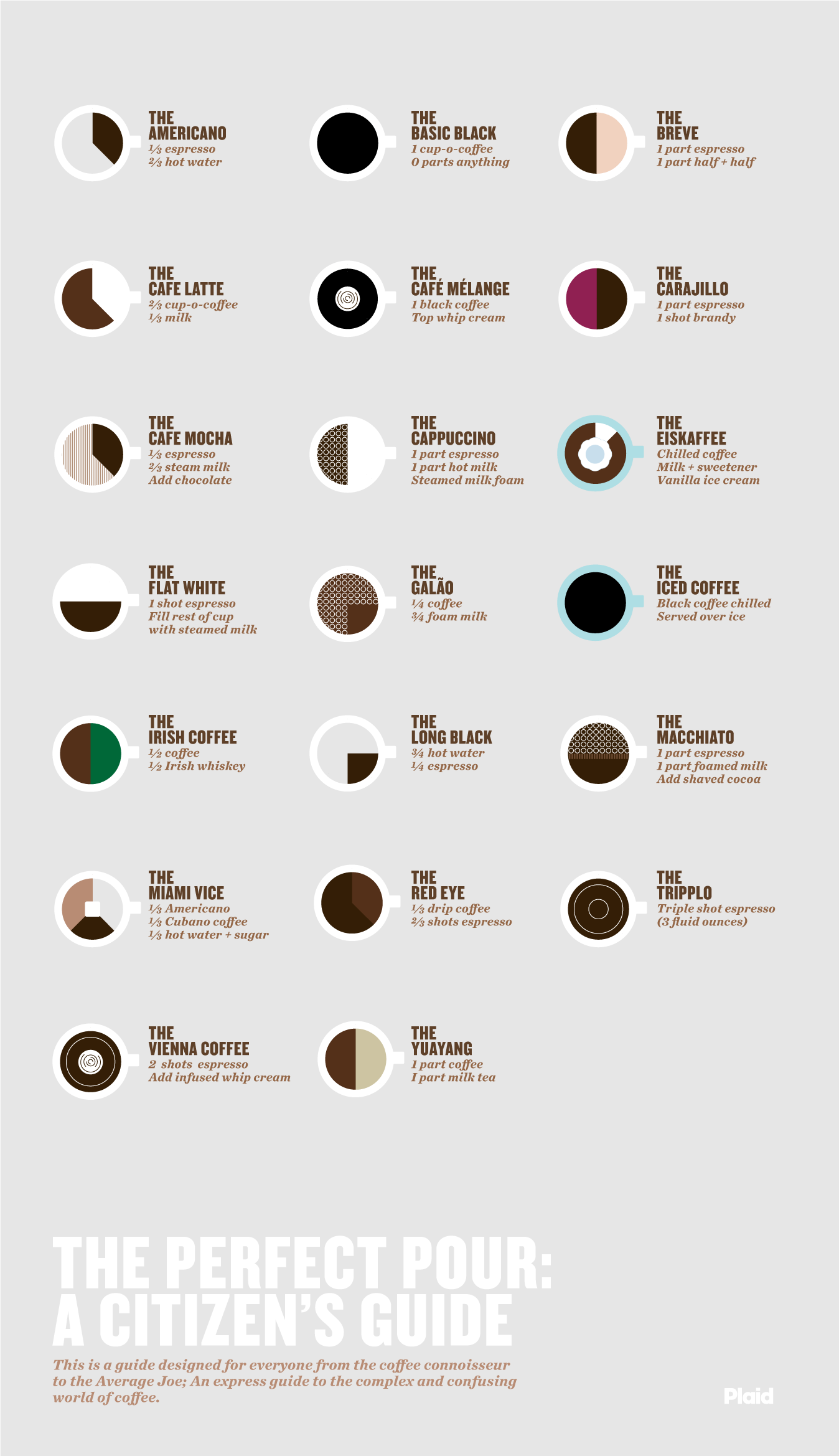
1. This infograph uses a sharply contrasting color palette to catch the eye in addition to a smart title and description. The image is focused on its center and information is clearly displayed. A glance to the left decrypts the colors used to stack this variation of a basic statistical representation. Overall, it is a well designed piece that demonstrates its point emphatically.


3. A more irreverent depiction of corporate structures, this image from uses loose fact behind the facade of humor to get its point across. Note the simple hand-drawn design and its general effectiveness at reaching its audience.


4. foursquare, one of the more popular services used in conjunction with smartphones, released this infographic to commemorate its 10 million membership mark. It combines the traditional look of infographics with a bit of subtle animation, something impossible to accomplish in print medium. In addition to the animation, note the size of the typeface and the clearly delineated spaces used to convey the message.


5. A larger timeline of Google’s legal activity, this image takes the long view in analyzing all of the information. Given the large amount of materials being condensed into one image, the clarity of the illustrate is pretty impressive, to say nothing of the subject at hand.


6. I love chocolate milk. Check out the use of associated images to create the milk bottle. The information is clearly delineated as your eye moves down the graphic. This is accomplished by milk-colored images and backgrounds in addition to the spectacular image included in the header. Makes me thirsty.


7. Many infographics attempt to take on contemporary issues. One recent trend is social deal websites, an offshoot of the general social media trend that has been around for a number of years, but has been more popular in the last few months.


8. Micro social media sites like Twitter have been extremely influential in certain circles. This chart compares user data and information being shared in a clearly defined comparison illustration. Note how each of these images utilizes colors reminiscent of the topic at hand to aid instant comprehension.


9. Timelines like this one are illustrated a larger body of work in an “instant” format. Although they might be larger and more unwieldy in a smaller screen, the image is designed to be taken one part at a time and the information is still comprehensible.


10. Another example of compartmented infographics, this one reads almost like a linear slideshow. Instead of a timeline, however, it is simply a breakdown of a complex theory on fixed asset management. By using diagrams and charts, the ideas being present are clearer than if they were simply written out. This is a far more complex body of information to present, but it is accomplished simply.


This article address’s what makes an effective information graphic. It points out how everything that I choose to design my information grahic with should be chosen wisely and with careful consideration. It also tells me about how a good information graphic creates excitement in the reader. However points out a good information graphic needs a good range of information before it is designed.

Jonathan Tzeng. (2011). I See An Infographic A Day. Available: http://unknowninkdesign.com/UID/i-see-an-infographic-a-day/. Last accessed 15/02/2013.

Previous winners in related competitions

Top Ten Typefaces Used by Book Design Winners

The American Association of University Presses (AAUP) holds an annual Book, Jacket & Journal Show which catalogs the best in book design and exhibits it around the country.

The jurors for this year’s show include some important names in typography, including William Drentel and Jessica Helfand of Design Observer, and typographer and type designer Kent Lew, who created the Font Bureau’s lovely and literary text face, Whitman.

Jessica Helfand and William DrentelSusan Colberg and Kent Lew
Jessica Helfand, William Drentel, Susan Colberg, and Kent Lew examine AAUP Show entries.

The catalog of the show is a beautiful record of the selected entries, and, because typeface credits are included, it’s also a good gauge of current trends in typeface selection for books and journals.

We ordered catalogs from the last three years of the show and tallied the typefaces used. The results won’t shock you — each of the top ten is a tried-and-true classic. Yet there is so much more great type out there begging to be used for academic text and titling. So, along with the champions, I’m recommending a few less common alternatives that offer just as much readability, function, and beauty for today’s books and journals.

1. Minion  VIEW AT FONTSHOP

minion

“Wild Plants of the Sierra Nevada” | Designer: Cameron Poulter | Cover type is New Caldeonia
With a set of 64 fonts in various optical size masters and a condensed option, Minion is one of the most complete serif families available. Add to that an economical width and what might be the most powerful endorsement of any book face — Robert Bringhurst used it for his seminal “Elements of Typographic Style” — and it’s no surprise that Minion is the most common typeface used in all three catalogs of the AAUP show.

Alternatives:

  • FF Meta Serif — Erik Spiekermann often recommended Minion as a workhorse serif until he went ahead and designed his own.
  • Karmina
  • Mentor

2. ITC New Baskerville  VIEW AT FONTSHOP

new-baskerville
“Memoirs and Madness” | Designer: David Drummond
New Baskerville isn’t far behind Minion in the tally of most popular book faces and, if you ask me, it’s a crying shame. Of all the members of this list, the digital ITC New Baskerville is too delicate and dainty to really perform well as a text face and in most settings it’s also far too antique for the subject matter. Yes, I know Ben Franklin was a big Baskerville fanboy, but we don’t need to take all his advice.

Alternatives:

  • Baskerville 1757 — If you must use Baskerville, skip the wispy ITC version and go with something meatier. Designer Lars Bergquist resisted the tendency to pare down hairlines and prettify serifs and other detail work.
  • Baskerville 10
  • Mrs. Eaves — Not a text face, but if the moment calls for a flowery Baskerville aroma and ostentatious ligatures this lady will perform well. Pay careful attention to her spacing and use only for display work.
  • Athelas
  • FF Clifford

3. FF Scala & 4. FF Scala Sans  VIEW AT FONTSHOP

scala
“Boris Yeltsin and Russia’s Democratic Transformation” | Designer: Ashley Saleeba
One of the first designs to come with sans and serif companions, this early FontFont is also one of the first serif typefaces to be originally designed specifically for the digital medium. FF Scala represents the only face on our list besides Minion designed after 1990. Its popularity in modern book design is obvious — it seems like every other museum catalog I see is set in Scala. Fine by me. They’re usually gorgeous.

Alternatives:

  • FF Nexus Serif — Martin Majoor’s follow-up to Scala is slightly heavier, warmer, and more traditional. In addition to the expected sans companion, Nexus also has slab and monospaced variants.
  • Fresco — A serif/sans pair from master Fred Smeijers that is truly contemporary. The Plus version has longer ascenders and descenders for more formal settings.
  • FF Tisa — Five years ago, the options for truly new serif faces were meager. But recently, graduates of rigorous type design programs have produced scores of contemporary designs for serious text setting. Mitja Miklavčič is an award-winning product of Reading. His low contrast Tisa is a genuinely new take on text types and a welcome nonconformist in the conservative field of book design.
  • Dolly

5. Adobe Garamond  VIEW AT FONTSHOP

garamond
“An Illustrated Chinese Materia Medica” | Designer: Tracy Baldwin
Robert Slimbach‘s 1989 interpretation has been for years the most popular digital rendition of the roman types of Claude Garamond, the go-to typeface for those wanting a little more elegance and old world charm than a Caslon or Timescould produce.

Alternatives:

  • Garamond Premier — Slimbach’s second take on the style represents nearly 20 years of research and drawing. And with its various cuts for different sizes, Garamond Premier is a more thoughtful tribute to the original metal type.
  • MVB Verdigris
  • Laurentian
  • Arnhem
  • FF Parango

6. Trade Gothic  VIEW AT FONTSHOP

trade-gothic
“From Revolution to Ethics” | Designer: David Drummond
The early gothic sans serif style (represented by TradeNews, and Franklin Gothic) could be considered America’s Helvetica, appearing on book jackets any time a basic sans is needed. Like Helvetica, they are used so often that they’ve lost much of their character. So unless banality is the goal, there are many alternatives that are either more interesting or offer more utility for modern design.

Alternatives:

  • Benton Sans — True to Font Bureau’s tradition, many of News Gothic’s quirks have been regularized for their reinterpretation, and Benton is livelier in the heavy weights, yet the original’s sturdy, no-nonsense tone remains. Most importantly, the family was expanded into a versatile 26-piece set.
  • Spiegel — In drawing a new headline face for the German magazine Der SpiegelLuc(as) de Groot transformed Franklin Gothic into a modern powerhouse.
  • Bulldog — Taking its cue from typefaces born before Franklin and News Gothic, Bulldog echos the organic, British idiosyncrasies of an early gothic by the Figgins foundry. Bulldog performs as well in text as it does in headlines, and though still uncommon, it’s been used successfully in annual reports and exhibition catalogs.

7. Electra  VIEW AT FONTSHOP

electra
“Arctic Spectacles: The Frozen North in Visual Culture, 1818—1875” | Designer: Ashley Saleeba
Perhaps Dwiggins‘ best work, Electra deserves to be in the top ten, but it’s a little light for modern presses.

Alternatives:

8. Fournier  VIEW AT FONTSHOP

fournier
“Crush” | Designer: Mary Valencia

9. Dante  VIEW AT FONTSHOP

dante
“The Selected Poetry and Prose of Andrea Zanzotto” | Designer: Maia Wright
Alternatives:

10. DIN  VIEW AT FONTSHOP

din
“Eye Contact: Photographing Indigenous Australians” | Designer: Amy Ruth Buchanan

http://fontfeed.com/archives/top-ten-typefaces-used-by-book-design-winners/

Time viewed 00:31

Book cover beauties.

By Scarlett Rugers / November 6, 2011 / CrimeThrillerNo Comments

I had a great experience with you. Your request form was a comprehensive idea of what I should keep in mind when thinking of a cover. A couple of the designers I approached were not as professional. You read my mind regarding colour scheme and other details. I would tell my friends to get a book cover designed- as long as it was with you! You’ve made the experience very easy and enjoyable. I’m especially impressed that I was vague in what I wanted but received a cover that exceeded my expectations. I was taken away by the extra efforts you put in being accessible, calling me on the phone, especially with the vast difference in time zones. I also appreciated that you kept me informed every step of the way from conceptualizing the design to the final version. You’ve been a delight to work with from beginning to end. As soon as I publish Dirty Dinar I would like to follow up with other covers, promotional tools, and a website redesign. Thankyou for making this a great experience.

– Fatima Fayez, author of Dirty Dinar

When researching into existing crime novel book covers I came across this beaut, what attracted me was the silhouette at the bottom and how that could be used in my own work. A silhouette of Manhattan perhaps?? Perhaps the blood on the cover is rather typical other than that this cover is lovely.    

I have fallen in love.

Designer: Trevor Baum
Package: (7 styles) regular, italic, bold, bold italic, black, black italic, and small caps
Cost: Donations (minimum $5)
A display typeface that’s both rugged and refined. Perfect for western and nostalgic Book Cover design. Inspired by the workmanship, lettering, and baseball jerseys of the 1930′s and 40′s.

Whilst looking into typefaces that I could perhaps use for my book jacket I came across this one which I LOVE! Pitty is the website asks for a donation witht he condition of purchasing it. There for all my final outcomes will be visually imagined with this typeface on. I <3 it!

http://www.losttype.com/font/?name=haymaker

Time 00:09