Previous winners in related competitions

Top Ten Typefaces Used by Book Design Winners

The American Association of University Presses (AAUP) holds an annual Book, Jacket & Journal Show which catalogs the best in book design and exhibits it around the country.

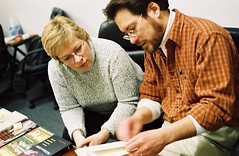
The jurors for this year’s show include some important names in typography, including William Drentel and Jessica Helfand of Design Observer, and typographer and type designer Kent Lew, who created the Font Bureau’s lovely and literary text face, Whitman.

Jessica Helfand and William DrentelSusan Colberg and Kent Lew
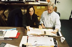
Jessica Helfand, William Drentel, Susan Colberg, and Kent Lew examine AAUP Show entries.

The catalog of the show is a beautiful record of the selected entries, and, because typeface credits are included, it’s also a good gauge of current trends in typeface selection for books and journals.

We ordered catalogs from the last three years of the show and tallied the typefaces used. The results won’t shock you — each of the top ten is a tried-and-true classic. Yet there is so much more great type out there begging to be used for academic text and titling. So, along with the champions, I’m recommending a few less common alternatives that offer just as much readability, function, and beauty for today’s books and journals.

1. Minion  VIEW AT FONTSHOP

minion

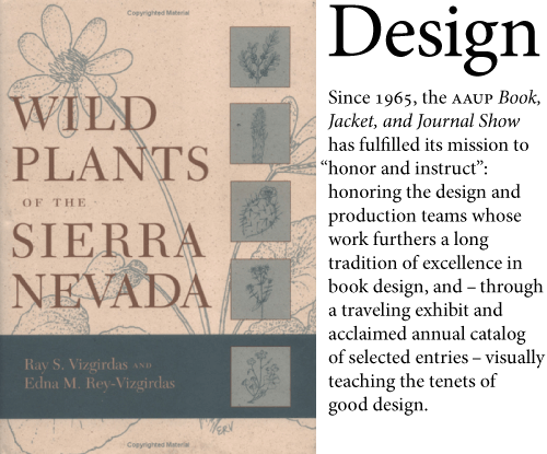
“Wild Plants of the Sierra Nevada” | Designer: Cameron Poulter | Cover type is New Caldeonia
With a set of 64 fonts in various optical size masters and a condensed option, Minion is one of the most complete serif families available. Add to that an economical width and what might be the most powerful endorsement of any book face — Robert Bringhurst used it for his seminal “Elements of Typographic Style” — and it’s no surprise that Minion is the most common typeface used in all three catalogs of the AAUP show.

Alternatives:

  • FF Meta Serif — Erik Spiekermann often recommended Minion as a workhorse serif until he went ahead and designed his own.
  • Karmina
  • Mentor

2. ITC New Baskerville  VIEW AT FONTSHOP

new-baskerville
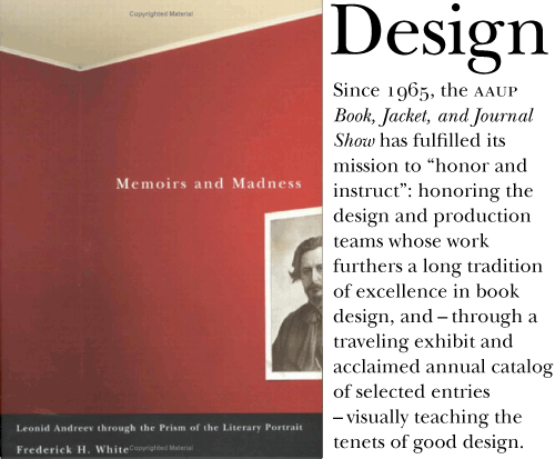
“Memoirs and Madness” | Designer: David Drummond
New Baskerville isn’t far behind Minion in the tally of most popular book faces and, if you ask me, it’s a crying shame. Of all the members of this list, the digital ITC New Baskerville is too delicate and dainty to really perform well as a text face and in most settings it’s also far too antique for the subject matter. Yes, I know Ben Franklin was a big Baskerville fanboy, but we don’t need to take all his advice.

Alternatives:

  • Baskerville 1757 — If you must use Baskerville, skip the wispy ITC version and go with something meatier. Designer Lars Bergquist resisted the tendency to pare down hairlines and prettify serifs and other detail work.
  • Baskerville 10
  • Mrs. Eaves — Not a text face, but if the moment calls for a flowery Baskerville aroma and ostentatious ligatures this lady will perform well. Pay careful attention to her spacing and use only for display work.
  • Athelas
  • FF Clifford

3. FF Scala & 4. FF Scala Sans  VIEW AT FONTSHOP

scala
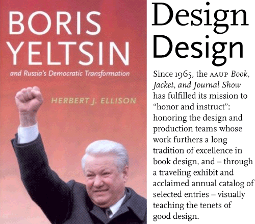
“Boris Yeltsin and Russia’s Democratic Transformation” | Designer: Ashley Saleeba
One of the first designs to come with sans and serif companions, this early FontFont is also one of the first serif typefaces to be originally designed specifically for the digital medium. FF Scala represents the only face on our list besides Minion designed after 1990. Its popularity in modern book design is obvious — it seems like every other museum catalog I see is set in Scala. Fine by me. They’re usually gorgeous.

Alternatives:

  • FF Nexus Serif — Martin Majoor’s follow-up to Scala is slightly heavier, warmer, and more traditional. In addition to the expected sans companion, Nexus also has slab and monospaced variants.
  • Fresco — A serif/sans pair from master Fred Smeijers that is truly contemporary. The Plus version has longer ascenders and descenders for more formal settings.
  • FF Tisa — Five years ago, the options for truly new serif faces were meager. But recently, graduates of rigorous type design programs have produced scores of contemporary designs for serious text setting. Mitja Miklavčič is an award-winning product of Reading. His low contrast Tisa is a genuinely new take on text types and a welcome nonconformist in the conservative field of book design.
  • Dolly

5. Adobe Garamond  VIEW AT FONTSHOP

garamond
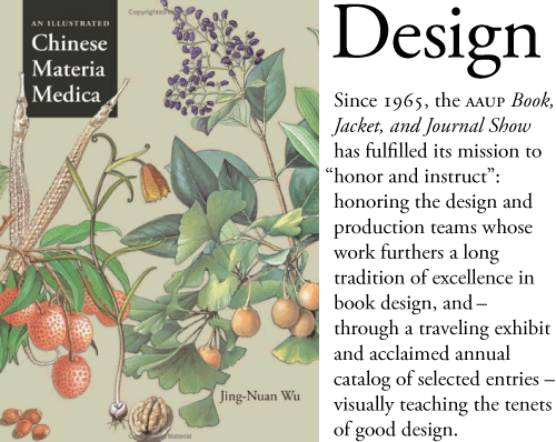
“An Illustrated Chinese Materia Medica” | Designer: Tracy Baldwin
Robert Slimbach‘s 1989 interpretation has been for years the most popular digital rendition of the roman types of Claude Garamond, the go-to typeface for those wanting a little more elegance and old world charm than a Caslon or Timescould produce.

Alternatives:

  • Garamond Premier — Slimbach’s second take on the style represents nearly 20 years of research and drawing. And with its various cuts for different sizes, Garamond Premier is a more thoughtful tribute to the original metal type.
  • MVB Verdigris
  • Laurentian
  • Arnhem
  • FF Parango

6. Trade Gothic  VIEW AT FONTSHOP

trade-gothic
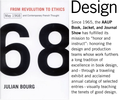
“From Revolution to Ethics” | Designer: David Drummond
The early gothic sans serif style (represented by TradeNews, and Franklin Gothic) could be considered America’s Helvetica, appearing on book jackets any time a basic sans is needed. Like Helvetica, they are used so often that they’ve lost much of their character. So unless banality is the goal, there are many alternatives that are either more interesting or offer more utility for modern design.

Alternatives:

  • Benton Sans — True to Font Bureau’s tradition, many of News Gothic’s quirks have been regularized for their reinterpretation, and Benton is livelier in the heavy weights, yet the original’s sturdy, no-nonsense tone remains. Most importantly, the family was expanded into a versatile 26-piece set.
  • Spiegel — In drawing a new headline face for the German magazine Der SpiegelLuc(as) de Groot transformed Franklin Gothic into a modern powerhouse.
  • Bulldog — Taking its cue from typefaces born before Franklin and News Gothic, Bulldog echos the organic, British idiosyncrasies of an early gothic by the Figgins foundry. Bulldog performs as well in text as it does in headlines, and though still uncommon, it’s been used successfully in annual reports and exhibition catalogs.

7. Electra  VIEW AT FONTSHOP

electra
“Arctic Spectacles: The Frozen North in Visual Culture, 1818—1875” | Designer: Ashley Saleeba
Perhaps Dwiggins‘ best work, Electra deserves to be in the top ten, but it’s a little light for modern presses.

Alternatives:

8. Fournier  VIEW AT FONTSHOP

fournier
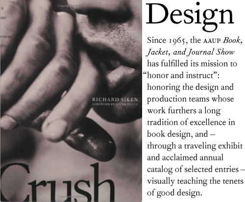
“Crush” | Designer: Mary Valencia

9. Dante  VIEW AT FONTSHOP

dante
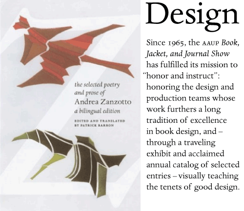
“The Selected Poetry and Prose of Andrea Zanzotto” | Designer: Maia Wright
Alternatives:

10. DIN  VIEW AT FONTSHOP

din
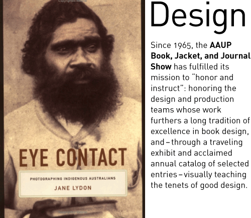
“Eye Contact: Photographing Indigenous Australians” | Designer: Amy Ruth Buchanan

http://fontfeed.com/archives/top-ten-typefaces-used-by-book-design-winners/

Time viewed 00:31

Book cover beauties.

By Scarlett Rugers / November 6, 2011 / CrimeThrillerNo Comments

I had a great experience with you. Your request form was a comprehensive idea of what I should keep in mind when thinking of a cover. A couple of the designers I approached were not as professional. You read my mind regarding colour scheme and other details. I would tell my friends to get a book cover designed- as long as it was with you! You’ve made the experience very easy and enjoyable. I’m especially impressed that I was vague in what I wanted but received a cover that exceeded my expectations. I was taken away by the extra efforts you put in being accessible, calling me on the phone, especially with the vast difference in time zones. I also appreciated that you kept me informed every step of the way from conceptualizing the design to the final version. You’ve been a delight to work with from beginning to end. As soon as I publish Dirty Dinar I would like to follow up with other covers, promotional tools, and a website redesign. Thankyou for making this a great experience.

– Fatima Fayez, author of Dirty Dinar

When researching into existing crime novel book covers I came across this beaut, what attracted me was the silhouette at the bottom and how that could be used in my own work. A silhouette of Manhattan perhaps?? Perhaps the blood on the cover is rather typical other than that this cover is lovely.    

I have fallen in love.

Designer: Trevor Baum
Package: (7 styles) regular, italic, bold, bold italic, black, black italic, and small caps
Cost: Donations (minimum $5)
A display typeface that’s both rugged and refined. Perfect for western and nostalgic Book Cover design. Inspired by the workmanship, lettering, and baseball jerseys of the 1930′s and 40′s.

Whilst looking into typefaces that I could perhaps use for my book jacket I came across this one which I LOVE! Pitty is the website asks for a donation witht he condition of purchasing it. There for all my final outcomes will be visually imagined with this typeface on. I <3 it!

http://www.losttype.com/font/?name=haymaker

Time 00:09

Lost with fonts

5 Great Fonts for Book Covers

by JOEL FRIEDLANDER on AUGUST 30, 2011 · 64 COMMENTS

Print Friendly and PDF   Share

Post image for 5 Great Fonts for Book CoversOne of the most consistent and easily corrected mistakes I see with book covers that are designed by authors is weak or inappropriate typography. Given that a book cover usually has very few words on it, and those words (title, subtitle, author’s name) have a huge influence on buying decisions, this can be a major problem.

For instance, if you’re writing about a topic considered masculine and aimed at a male audience, does it help you to have an overly-embellished or feminine typeface that’s barely readable on your book cover? No, I don’t think so either. Or for a historical romance, you wouldn’t want a modern clean sans serif typeface like Helvetica for your cover. It would simply look dangerously out of place.

How Inappropriate Typefaces Happen

The reasons some authors end up with this kind of typography on their book covers include:

  • A lack of design training
  • Only judging what is seen on the screen and being unable to visualize the effect on a printed cover
  • Using the typefaces that came with the computer

This last reason is probably the most common. After all, when you look down that long list of fonts, it seems that there should be something there that’s usable, right? But that’s not always the case.

Display fonts are different from text fonts. Their weights, spacing, set widths and many other tiny details differ. It’s difficult to impossible to make a text typeface look really good on a book cover. I’m not saying you’ll never see this done well, but it’s much more likely that the cover you’re looking at with that gorgeous Garamond on it was done by a professional designer with years of experience and a lot of graphic tricks up her sleeve.

No, it’s far better for amateurs to use display typefaces when it comes to their book covers. To help out, here are 5 typefaces, some of them free, that you can experiment with on your book covers.

5 Great Fonts for Your Book Cover

To get you started, I’ve collected 5 great fonts for book cover design. Even better, three of them are free, and you can download them at fontsquirrel.com, so start experimenting with these for your book cover.

1. Chunk Five (free from fontsquirrel.com): This meaty and emphatic slab serif font is ideal for book titles in numerous genres. Try this font for action-oriented or political stories. Here’s a cover I did for an around-the-world sailing story:

great fonts for book covers

book design for self-publishers

2. League Gothic (free from fontsquirrel.com): This sans serif font is very vertical, which is ideal for book titles. League Gothic would be a great choice for thrillers or business books, and it can be useful if you have a very long title, too. Here’s a sample on Joanna Penn’s terrific thriller.

great fonts for book covers

great fonts for book covers

3. Trajan (available from Adobe): You might recognize Trajan, and that’s because it’s been used for more movie posters than any other font. It works quite well on books, too. This classic font is appropriate for histories, novels, and historical fiction, among others. Check out the French film poster using Trajan.

great fonts for book covers

great fonts for book covers

4. Franchise (free from fontsquirrel.com): Another tall and meaty sans serif, just ideal for the right book cover treatment. Franchise would be a great pick for a historical epic, for mysteries, or for thrillers. Here’s a sample of a novel in a gritty urban setting.

great fonts for book covers

great fonts for book covers

5. Baskerville (many versions available): Sometimes you need to have a straight roman typeface for your title, and in that case I like to use one of the variations of Baskerville, a highly readable typeface. You might find Baskerville perfect for a memoir, a business book, or a historical romance. Here’s a sample, and a cover from Vintage Books that shows how effective it can be.

great fonts for book covers

great fonts for book covers

The best way to see the effect these fonts will have on your book is by trying them out. Since most of them are free, there’s no reason not to. Just looking at these fonts and imagining them on a book cover helps give you a sense of how the fonts you choose influence the look and tone of your book.

I was stuck as to which typeface I could use on my book jacket so I chose to ask Google’s advice which lead me to this website. Giving me five suggested typefaces, this article suggests to just give a typeface a try and see what feeling it evokes. Personally I feel that If I had a great knowledge of typefaces I would have more of a gut feeling as to what typeface I would use.. I do have a preference to a sans serif typeface as I feel it has more impact. 

For the book cover that is designed to be part of a series I would consider a serif typeface as I feel they have more historic emotions to them.

http://www.thebookdesigner.com/2011/08/5-great-fonts-for-book-covers/

Time viewed 23:49