-
Handmade fonts.
-
Handmadefont is an incredible project that features a vast range of typographic designs. Entire font sets are created using a wide range of mediums and materials, resulting in typefaces and lettering that are totally original.


-
Let your Japanese spirit out!
This font is made of copper- the Copper origami. We hired a Japanese guy and it took him 24 seconds to make all the letters. Damn, he was fast! But we got a beautiful font that is simple and suitable for all blacksmiths round the world to promote their doings. 


-
Sorry,I’m busy being cool and colorful!
This font will blow your mind!All those blod colors! Very abstract, stylish and hip with different shapes of triangles collected all together the Color boom font is made for courageous people. It is gritty and daring with the touch of math subject. 


-
You might have caught a fish!
What is that smell? Oh, yes. It’s the smell of Fish font here. I did’t belive that our boss would catch anything bit he did and yes, we made a font out of it. A very-very real looking font made of fishes to all fish-lovers ! 


-
Strawberry fields forever!
A very berry Strawberry font made of wild strawberries. All natural with leaves and different shades of red the Strawberry font is hard to look at because you just want to eat it! This very cute font makes you think about those summerdays at your Granny’s place. 


-
I know no boundary!
I brought work home and look what happened! My kid was playing and got those colors all over my work stuff. Being inspired I made a Fun paint font. This font is made with different colors and with letters in paint spatters. You can paint your own colorful and fun story with Fun Paint font! 


-
How to spilt wood correctly?
How to harness your inner-lumberjack and hew some firewood with your own manly hands? You need a maul or ax and wood. Ha! Just kidding. We chopped all the wood for you and made pieces of wood font. Very natural beige wood with darker edges compound into letters. 


-
Rocky got stoned.
Rock optimize font is more than just stones. It is smooth , modern and angular. The color of this font is mostly soft grey but there are shadows caused by angles that mix up the grey with lighter and darker shades. This font could be used to illustrate some movie posters. 


-
Wimbledon IS ON!
All nice and green- the Tennis grass font- made for playin’. Tennis grass font is in perfect grass- green color with tiny shadows made by court enlightenment. It’s ideal to promote out-door activities or obviously tennis. I bet this font can beat the Williams sisters! 


-
-
We are very interested in requests for developing new and unique fonts for advertisement campaigns, packing, magazine covers etc. We are always open to any cooperation offers. We work on a various range of commissions across different budgets. Our work has been published among various magazines and journals. We also create different visual communication solutions for a range of clients and industries and our projects involve art direction, branding, stationery, publications, exhibitions, websites, packaging and signage systems.
We make ideas real through beautifully crafted design.
We believe good ideas can be applied to anything. 
Category: Uncategorized
Most visited shopping cities.
City ranking
The most completed cities
- CM13 – Brentwood : 12612 shops
- B1 – Birmingham : 2168 shops
- LS1 – Leeds : 1803 shops
- G1 – Glasgow : 1799 shops
- EH1 – Edinburgh : 1676 shops
- L26 – Halewood : 1481 shops
- M1 – Manchester : 1452 shops
- S25 – Anston : 1369 shops
- LE19 – Braunstone : 1362 shops
- CF10 – Blackweir : 1295 shops
- NG9 – Attenborough : 1218 shops
- BS1 – Bristol : 1109 shops
- NR1 – Norwich : 1029 shops
- RG1 – Reading : 928 shops
- DE1 – Derby : 927 shops
- BT1 – Belfast : 900 shops
- OX1 – Oxford : 900 shops
- SO97 – Southampton : 884 shops
- CB1 – Cambridge : 878 shops
- NN6 – Brixworth : 866 shops
- PL1 – Devonport : 864 shops
- AB10 – Aberdeen : 850 shops
- M17 – Manchester : 790 shops
- PR4 – Bryning : 761 shops
- GL19 – Birdwood : 742 shops
- CH1 – Blacon : 710 shops
- NE16 – Hobson : 696 shops
- HU1 – Hull : 687 shops
- BH1 – Bournemouth : 687 shops
- MK1 – Bletchley : 643 shops
The least completed cities
- LU3 – Lower Sundon : 0 shop
- PH5 – Muthill : 0 shop
- TD3 – Gordon : 0 shop
- FK19 – Auchtubh : 0 shop
- FK18 – Creagan : 0 shop
- CB5 – Fen Ditton : 0 shop
- LN3 – Tupholme : 0 shop
- SA37 – Pontselli : 0 shop
- LL25 – Dolwyddelan : 0 shop
- LN7 – Howsham : 0 shop
- L33 – Knowsley Industrial Park : 0 shop
- LL33 – Abergwyngregyn : 0 shop
- L29 – Sefton : 0 shop
- LL71 – Coedana : 0 shop
- SA35 – Bwlchygroes : 0 shop
- SA36 – Glogue : 0 shop
- SY19 – Bont Dolgadfan : 0 shop
- CA18 – Broad Oak : 0 shop
- YO22 – Beckhole : 0 shop
- NE69 – Bamburgh : 0 shop
- NE41 – Wylam : 0 shop
- HU6 – Dunswell : 0 shop
- TA17 – Allowenshay : 0 shop
- TA16 – Eggwood : 0 shop
- TN7 – Chuck Hatch : 0 shop
- BT7 – Ormeau : 0 shop
- BT65 – Drumgask : 0 shop
- NE34 – Middlefields Industrial Estate : 0 shop
- AB13 – Milltimber : 0 shop
- PH12 – Kirkinch : 0 shop
The most visited cities
- CH62 – Bromborough : 75 shops
- GU1 – Guildford : 485 shops
- LE4 – Thurmaston : 27 shops
- CT1 – Canterbury : 389 shops
- SO30 – Hedge End : 36 shops
- N1P – Islington : 71 shops
- NR1 – Norwich : 1029 shops
- IG1 – Ilford : 320 shops
- CO1 – Colchester : 516 shops
- DA9 – Bluewater : 340 shops
- SK1 – Stockport : 498 shops
- SG1 – Stevenage : 267 shops
- LE11 – Loughborough : 220 shops
- RG1 – Reading : 928 shops
- ST1 – Hanley : 151 shops
- BR1 – Bromley : 410 shops
- CR90 – Croydon : 460 shops
- LL30 – Llandudno : 136 shops
- BD1 – Bradford : 493 shops
- OX28 – Witney : 111 shops
- HG1 – Harrogate : 335 shops
- BN11 – Worthing : 317 shops
- GL50 – Cheltenham : 508 shops
- WR1 – Worcester : 558 shops
- NN17 – Corby : 135 shops
- LS1 – Leeds : 1803 shops
- WS1 – Walsall : 270 shops
- DE1 – Derby : 927 shops
- G1 – Glasgow : 1799 shops
- GU14 – Farnborough : 151 shops
http://www.shopping-time.co.uk/horaires/top-villes.php
In my rational I speak about locating and targeting Thorntons stores in the top 150 shopping cities. This is one of the websites I used to research into which cities are actually most visited.
the history of the pin up.
| The History of Pin-Up Art The Art History Archive – Erotica
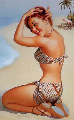
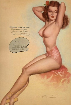
The History of Pin-Up Art Prehistoric man obviously had some degree of veneration for the female form, judging by Paleolithic sculptures of well endowed women. Anthropologists are unsure if they symbols of fertility or erotic talismans passed around by horney hunters. These Venuses served a need or the common good somehow, even if they don’t follow our strict definition of pin-up… Ancient Greeks were unashamed by modern standards in acceptance of the nude figure. The original Olympics were contested by naked athletes. Male athletes. Still, there are many examples of Hellenic Godesses, all in fashionable dishabille. The Greek Gods also had a tendency to interact with mere mortals in many carnal stories. Depictions of these sorts of encounters call for a degree of audience participation, understanding and involvement. In Pompeii and the Roman world, erotic art was woven into the fabric of everyday life. Frank sexual depictions were found in public marketplaces, murals and sculptures. Once Christianity became the official religion of the state under Emperor Constantine in the Fourth Century, immoral ‘pagan’ imagry was banished and driven underground. Thus, unless you have a fetish for Mary Magdeline, the Dark Ages had begun. Beyond religious artifacts and decorative arts, there was scant representation of sacriligious pleasures of the flesh during Medieval times.
When a merchant class could support artists instead of just The Church, a new definition of feminine beauty could be commissioned. With municipal buildings and private villas to decorate in the city states of Italy, the myths and historical figures of ancient Rome provided ample material. Leda and the Swan, the birth of Venus and other fables provided convenient excuses to display comely nudes. All facets of science and secular humanism were brought to bear in creating the great body of works known as the Renaissance. Such classical values were imparted by Da Vinci (1452-1519), Michaelangelo (1475-1564), Titian (1485-1576) and others.
In Europe during the 1800s, there were movements to escape the excesses of the Baroque and Rococo periods and return to classical simplicity. Neoclassicism was formalized in Europe as an outgrowth of Academic Art and again the popular characters from the past were represented by mostly nude models, such as Paul Thurman’s ‘Psyche’. Orientalists could display nude alegorical figures in lush exotic settings without reproach. An odalisque, or harem concubine was a popular subject. Also in the 19th Century, Classicism was taken to an extreme by the English movement called the Pre-Raphaelites. While their strict adherence to Renaissance styles did not last long, their works were very influential on the Golden Age of Illustration. Early American influences in magazine and print illustration include Howard Pyle (1853-1911), his Brandywine school and students such as N. C. Wyeth (1882-1945), Harvey Dunn (1884-1952), Frank Schoonover (1877-1972) and Maxfield Parrish (1870-1966). Dean Cornwell (1892-1960), John La Gatta (1894 – 1976) and Andrew Loomis (1892-1959) were also major forces in magazine and advertising illustration. The Arts and Crafts and decorative Art Nouveau movements in Europe also contributed to the artistry and styles of the times.
What good is a work of art if only a select few can view it? The middle ages offered illuminated manuscripts, available only to wealthy patrons. Even the development of printing didn’t democratize illustration because of the small scale and painstaking process in producing graphics. The intersection of economics and technology would provide an improved means of distribution over the last two centuries. Lithography was invented in the end of the Eighteenth Century. The birth of photography soon after provided new techniques for printing and the adoption of the offset method at the turn of the twentieth century allowed for larger, faster and better quality print jobs. Once printed materials were available to a vast public, the Golden Age of Illustration was said to begin. The Golden Age is conveniently placed from 1880 to 1920, although there are arguments which can take it from the end of the Civil War until World War Two. The development of economical high speed printing and an increased literacy built a tremendous audience for the only available forms of mass communications at the time: Books, papers and magazines. Publishers and later advertising agencies competed for the services of those artists, such as Norman Rockwell (1894-1978) who could generate memorable images for mass consumption, oftentimes on strict deadlines. Following the War, the realistic end of the spectrum was consigned to photographs of varying quality. With such a glut of magazines to fill, skilled photographers and attractive models were in short supply. The art world was overtaken by the Abstract Impressionists, a style that is not condusive to the pin-up genre!
If art can be said to hold up a mirror to society, then the pin-up occupies a particular place of honor in modern art, particularly that of the latter half of the Twentieth Century. Prior to that, Duchamp and dadists explored the concept of what constitutes art. A painting of a pipe, a ‘fountain’ made from a urinal and other works challenged the role an artist played in relation to the world around themselves. Provocative images, particularly used in advertising, were on the blade’s edge between sex and commerce. As consumerism rose, particularly after World War II, the icon of pitchwoman was particularly ripe for lampooning. The Pop (for Popular) Art revolution had begun. Drawing on atavistic figures like Marilyn Monroe or an anonymous sex symbol, reality is processed and packaged up Since such artists’ work is exhibited in museums, galleries and coffee table books, they do not strictly pass the test for mass-produced pin-up designation. Still, their very existence proves how durable an architype the pin-up model is.
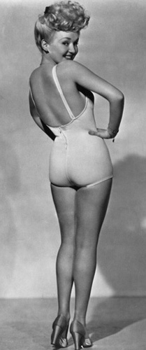
Additionally, there are several contemporary artists such as Nagel, Kacere and Koons who reassert what it is to take command of their media and use a photorealistic or painterly approach. A pin-up girl is a woman whose physical attractiveness would entice one to place a picture of her on a wall. The term was first attested to in English in 1941; however the practice is documented back at least to the 1890s. The “pin up” images could be cut out of magazines or newspapers, or be from postcard or chromo-lithographs, and so on. Such photos often appear on calendars, which are meant to be pinned up anyway. Later, posters of “pin-up girls” were mass-produced. Many “pin ups” were photographs of celebrities who were considered sex symbols. One of the most popular early pin-up girls was Betty Grable. Her poster was ubiquitous in the lockers of GIs during World War II. Others pin-ups were artwork, often depicting idealized versions of what some thought particularly a beautiful or attractive woman should look like. An early example of the latter type was the Gibson girl, drawn by Charles Dana Gibson. The genre also gave rise to several well-known artists specializing in the field, including Alberto Vargas and George Petty, and numerous lesser artists such as Art Frahm. These days men can be considered “pin ups” as well and there are male equivalents of attractive and sexy actors such as Brad Pitt or numerous male models. The counterpart term to “cheesecake” is “beefcake”.
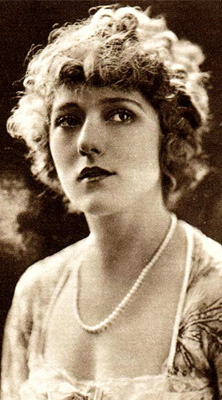
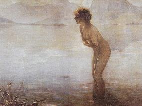
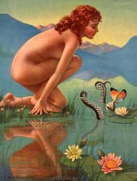
Modern Pin-up Art The modern antecedents of the pin-up can be traced to the Gibson Girl in America, who made her debut in 1887, and the Art Nouveau posters of Alphonso Mucha and Jules Cheret in Europe. The prototypical pin-up postcard artist of the nineteenth century, Raphael Kirchner, contributed to the establishment of the “pretty girl” format. Also becoming publicly acceptable was such mainstream popular art as ‘Psyche at Nature’s Mirror’ by Paul Thumann, first seen in Munsey’s December 1893 Issue. White Rock beverages then adopted it as their trademark and, by 1947, the demure Psyche was attending parties topless! Two popular Glamour icons to follow the Gibson Girl, were those of Howard Chandler Christy and Harrison Fisher. At the turn of the century, the calendar was the most prominent form of pin-up material, especially the early “glamour girl” formats by Angelo Asti. In 1913 the controversial nude ‘September Morn’ by Paul Chabas was censored by the New York Society for the Supression of Vice. Still, the image was subsequently printed on literally hundreds of thousands of calendars, in addition to candy boxes, postcards and more. The Art Deco period also made respectable any art featuring Romantic nudity, such as that of Mabel Rollins Harris, Maxfield Parrish and Hy Hintermeister. |
|
|
|
||
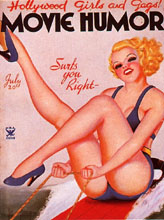 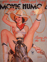 By the 1920s, the golden age of illustration was in full flower. The new film industry fueled the public’s appetite for magazines devoted to their celluloid heroes. In the 1800s, a glimpse of a woman’s bare ankle could be considered scandalous. Compare that with the blatantly sexual girls of the Roaring Twenties by Enoch Bolles, George Quintana and Earle K. Bergey just a generation later! Corporations and advertising agencies were likewise vying for the services of talented artists to create identities the public would respond to. A significant pre-war American advertising icon was the Arrow Shirt man, portrayed brilliantly by J.C. Leyendecker. Although Leyendecker is primarily known for his depictions of men, he had a profound influence upon popular illustrators such as Norman Rockwell and many who followed.As popular culture devoured its forbidden voyeuristic fantasies in pulp magazines, and later paperback books, another trend had begun to legitimize the pin-up as a serious art form: Higher brow fare offered by such slick periodicals as Esquire (an important predecessor of Playboy), Cosmopolitan, The Saturday Evening Post and others. Art Deco depictions of the female form were considered tasteful enough for inclusion in these magazines. Alberto Vargas makes for a convenient figure as we watch his style evolve from coy to more explicit. The fact that he started at Esquire and ended up at Playboy also makes for a barometer of trends within pin-up. By the 1920s, the golden age of illustration was in full flower. The new film industry fueled the public’s appetite for magazines devoted to their celluloid heroes. In the 1800s, a glimpse of a woman’s bare ankle could be considered scandalous. Compare that with the blatantly sexual girls of the Roaring Twenties by Enoch Bolles, George Quintana and Earle K. Bergey just a generation later! Corporations and advertising agencies were likewise vying for the services of talented artists to create identities the public would respond to. A significant pre-war American advertising icon was the Arrow Shirt man, portrayed brilliantly by J.C. Leyendecker. Although Leyendecker is primarily known for his depictions of men, he had a profound influence upon popular illustrators such as Norman Rockwell and many who followed.As popular culture devoured its forbidden voyeuristic fantasies in pulp magazines, and later paperback books, another trend had begun to legitimize the pin-up as a serious art form: Higher brow fare offered by such slick periodicals as Esquire (an important predecessor of Playboy), Cosmopolitan, The Saturday Evening Post and others. Art Deco depictions of the female form were considered tasteful enough for inclusion in these magazines. Alberto Vargas makes for a convenient figure as we watch his style evolve from coy to more explicit. The fact that he started at Esquire and ended up at Playboy also makes for a barometer of trends within pin-up.
While Vargas was refining the centerfold concept, a contemporary of his was pursuing an even higher profile venue – that of superstar commercial artist. George Petty had worked for Esquire (Vargas replaced him after a dispute over salary), but the ‘Petty Girl’ was a fixture from the 1930s until the 1950s. The Petty Girl pitched a dizzying array of products to a national audience. She became so firmly entrenched in the public’s consciousness that a movie was actually made about her – a fictitious airbrushed icon.
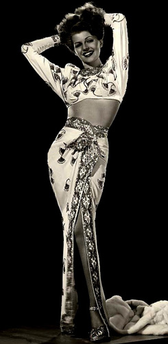
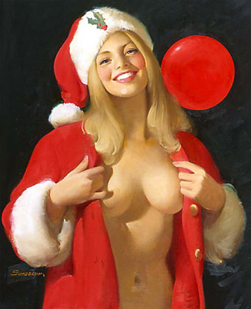
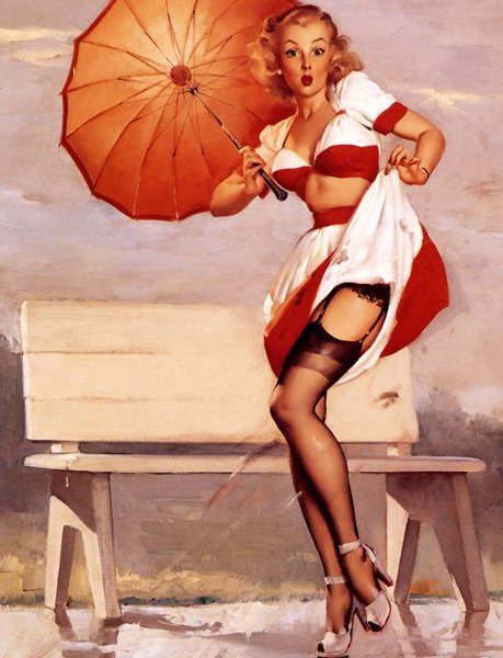
During World War Two, pin-ups accompanied G.I.s in the form of movie star photos like Betty Grable and Rita Hayworth. Vargas pin-ups were also very much in evidence in the barracks and as nose-art of the Airforce. Additionally, the Louis F. Dow Calendar Company produced special booklets of pin-up art created by their star artist Gillette Elvgren to be mailed overseas. Check out the Collector’s Press Military Pin-Up Kits for example. After the war, Christian Dior introduced his ‘new look’, war restrictions on luxury items such as nylons were lifted and undergarments finally made the transition to two separate pieces, the bra and the girdle. Society had moved past the androgynous flappers and the economically depressed 1930s to a new age of prosperity. The move towards commercialization was well under way. If a pretty, wholesome girl-next-door could be utilized to sell a product, why not a girl in stockings modestly flashing some skin (But she’s always a ‘good girl’ – Its not her fault that playful puppy pulled her skirt over her head!). If anyone is responsible for the explosion of vibrant beautiful pitchwomen, it is Chicago artist Haddon Sundblom. Sundblom’s lush oil technique influenced a roster of important pin-up artists. The most famous pupil was Gil Elvgren, who worked at Sundblom’s Stevens-Gross advertising agency along with such notable artisans as Al Buell, Harry Ekman, Bill Medcalf and Joyce Ballantyne. Their technique of using thick layers of paint to achieve a warmth and glow was dubbed ‘the mayonnaise school’. Other descendants of this style of luminous illustration included Donald ‘Rusty’ Rust, Art Frahm, Peter Driben, Edward D’Ancona, Edward Runci, Vaughan Alden Bass, Al Brule and Pearl Frush.
Independent of the national accounts for specific products and services, there were other fertile markets for pin-up art. Brown & Bigelow, for example, consider themselves in the ‘rememberance advertising’ business. They produce office supplies, playing cards and calendars, many of which are designed to be imprinted by small companies and then given away as promotions. They employed some of the best talent to design both generic and industry-specific artwork. Although they, as well as other calendar publishers, occasionally produced nude or ‘racy’ product, they sought not to alienate their conservative or religious customers with such fare. Brown & Bigelow also supported several styles of pin-up. In addition to the strait-forward realistic oil paintings of Elvgren and others, they also utilized pastel artists, such as Rolf Armstrong, Earl Moran, Billy de Vorss and Zoe Mozert and originated the ‘sketch book’ genre pioneered by Earl MacPherson and used to great success by Ballantyne, T.N. Thompson, Fritz Willis, K.O. Munson, Freeman Elliot, Ted Withers and others.
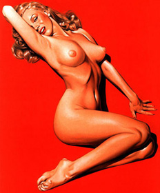
Playboy created a sensation with their centerfold of Marilyn Monroe in 1953. Until that time, it was primarily Esquire who provided opportunities for a generation of pin-up artists, including Ben-Hur Baz, Ernest Chiriaka, Mike Ludlow and J. Frederick Smith. Although Esquire had presented photographic pinups previously, they never contained overt nudity. An interesting footnote to the Pop Art movement of the 1960’s is the work of Mel Ramos, who combined nude pin-ups with recognizable corporate images for a satiric blend of cheesecake and commercialism. Another modern artist of mention isPatrick Nagel, who died tragically early in his promising career. Although Nagel’s work has the cool aesthetic of woodblocks and don’t invite the viewer into a realistic depiction, the fact that his original paintings, and that of his modern contemporaries, commands incredible prices speaks to the current attitudes towards the subject of pin-up as a modern art form.
The introduction of explicit men’s magazines (Penthouse introduced the world to pubic hair in 1970) made such innocent depictions seem quaint and old-fashioned. Photography was a quick and easy means to satisfy the pressures of monthly deadlines. Today’s sex symbols seem to be comprised of pre-packaged teen sensations, silicone-enhanced quasi porn stars and anorexic ‘supermodels’. Modern pin-up artists such as Olivia de Berardinis, Hajime Sorayama, Carlos Cartagena, Jennifer Janesko, Alain Aslan and John Kacere have turned their vision towards photorealistic fantasy or fetishistic subjects and lack the innocence of their predecessors. (Many also tend to specialize in airbrush, a technique that can leave a cold, hard and artificial look.) Still there are those, such as Dave Stevens, who have not forgotten how to draw a good girl in a bad situation without showing us every anatomical detail of his subjects. We must thank Dave, not only for creating the Rocketeer character, but for reviving interest in the great photo pin-up gal of the 1950s, Bettie Page. I am also particularly fond of some modern European illustrators such as Milo Manara. (There’s also Eric Stanton, who provided us with bad girls in bad situations, but that is the opposite direction of cheesecake!) To draw the line arbitrarily, I have created a page specifically for another interest of mine, comics. Although Stevens, Greg Hildebrandt, Jay Pike, Bill Ward and others have experience in the comic world (Which includes the sub-genres of ‘good girl’, ‘bad girl’, superheroine and Anime), their depictions continue to expand my precepts of successful pin-up art and are documented elsewhere.
Pin-Up Artists:
|
||
My original idea was to keep the theme of the 40’s & 50’s pin up however after researching into the history of the movement I established that perhaps this is just too saucy. My choice however is to still keep this theme but simply take inspiration from it and not mimic the style. this will be through employing the rich tones and overall moods of the illustrations. Perhaps in the form of photographs.
Embrace the competition.
In conclusion, it’s important to remember that incorporating creative opposition begins with asking the right questions. What is your company’s “black market”? What is its “underground”? Who are your misfits, your hackers? Who are the people who might want to “occupy” your company? Who is seeing the cracks in your organization and seeking to attack them? Invite them to do so before they invite themselves (and others along with them). Make sure your internal opposition has ample safe space to self-organize, is always close, and utterly creative. Resist the temptation to squash resistance. Bring the renegades into the mix and not into the fold. And remind yourself that occasional disloyalty might be the strongest form of loyalty.
In this article it talks about how embracing the enemy company can help develop your business. It asks them to ask themselves why is that company their competition and what could they do in order to keep their strength in keeping the competition at bay. For example run test scenarios where the worst does hypothetically happen- this way if ever the worst does happen you will be prepared.
This could guide me in order to look further into Hotel chocolate and Cadbery world and see how they organise their company. The article also lightly touches upon embracing technology, to think innovatively when employing advertising tactics. A strong hint in directing my own work.
“User experience is always at the heart of any company”
“If you start with ‘useful’ as a first principle, then you automatically place customer need and experience first,” writes Wolff Olins head of strategy Mary Ellen Muckerman in an article in Fast Company this morning.
Muckerman continues:
“The principles and theories of UX have created a new normal in terms of brand delivery and interaction. They state that how people actually use your product is much more important than how it was intended to be used. So engaging your consumer in ongoing, iterative product development is more valuable than holding out for a “perfect” product launch.”
She looks at Apple’s ascendence over the past decade, M-Pesa’s branchless banking system, and Zopa, the world’s first peer-to-peer money lending service as 3 case studies on being useful. Continue reading on Fast Company here.
This is a caption from a blog produced on www.wolffolins.com. A new and refreshing brand agency. It speaks about how every choice made When developing a brand should be made with the customer in mind. The writer, Mary Ellen Muckerman gives the example of apple and there journey through the last decade. This gives me a strong reminder that when developing my own brand I should keep the consumer in mind at all times!
